How to magically destroy your marketing efforts

August 6, 2012

Magician's hatMarketing is all about leading your customers and prospects down a clear path that leads to their purchasing your product or engaging your services. There is little room for ambiguity in marketing since you have people’s attention for such a brief moment in time. Your marketing messages—PowerPoint presentations, websites, social media, or any other marketing vehicle—should always clearly state what you want people to do and the benefits to them of doing it.

I recently saw an egregious example of mixed messages that made me doubt whether the person involved was really interested in his continued employment!

I was having breakfast at a diner in my town when another patron overheard me talking about the local newspaper. He introduced himself as a sales rep from that paper and talked to me a little bit about my business. He then handed me his business card, a typical black-on-white number with raised printing.

As I was reading the card, I could feel printing on the reverse so I turned it over. I expected to see more details about his job or his employer. Instead, it was a completely different business being advertised. You see, our man is also a part-time magician, so he thought he’d combine his moonlighting gig with his day job on a single business card.

“Your boss must have been impressed,” I quipped and he replied that the publisher was really angry but had let it slide. He then chuckled and told me about a magic show he’d just performed at a day camp. After the performance, who should he see stroll by but the publisher! She saw him in his magician’s outfit and knew that he wasn’t out selling ad space for her paper.

There are several lessons we can learn from this:

  • You should have one consistent marketing message. To use a PowerPoint example, think of how confused your audience would be if after your closing slide you showed one last slide that advertised your side business. How much respect would you lose in that moment?
  • Always reinforce your brand. It’s crazy that the publisher didn’t make this guy throw away the two-sided cards and pay for a reprint with just the newspaper job information. One card, one business. Period. Here’s the PowerPoint tie in: you decide that your corporate template is too boring so you change the colors around. Now your deck doesn’t look like your other marketing materials, and that inconsistency can be jarring to your audience.
  • Concentrate on your core competencies. We all know that a jack of all trades is a master of none. To build trust that we know what we’re doing, we need to focus on what we do best. A newspaper advertising sales rep who promotes his own business during his sales calls obviously doesn’t have my best interests in mind. In a presentation, you must tailor your message to your audience. If your company does five different things but the audience is only interested in one of them, concentrate on that one thing. Mention your other abilities in passing, but focus on what’s important to your audience.
  • Don’t bite the hand that feeds you. If you are invited to present for one reason (“Please tell us the results of advertising in your newspaper.”) then use that time to promote a different business entirely (Magician for hire! Parties, bar/bat mitzvahs, you name it!), you won’t make a good impression because nobody likes a bait-and-switch.

It’s incredible to me that anybody would have the gall to hand out business cards like this. I suspect that this fellow’s job could “vanish right before his very eyes” if he doesn’t straighten out quickly.


Good presentations start with good scripts

May 31, 2012

ScreenplayA gentleman once asked me to provide a quote on redoing a PowerPoint presentation. He provided a link to the presentation, which included a voiceover narration.  I had to explain to him that he’d be unhappy with the results if I just did the cosmetic fixes he’d asked for. Sure, the presentation would’ve looked better, but it wouldn’t have made it a better presentation. Redesigning the presentation in its current state would’ve done nothing to address the basic problem: the visuals didn’t match the script.

The script is what you as the presenter are going to say when you’re up in front of the audience, or what your narration will be on a mobile presentation. Some people create PowerPoint presentations first then write the script to match the visuals. This is absolutely the opposite approach you should take. Think about how all movies start with a script. It would be absurd to shoot a movie without one. Just as it’s absurd to create a PowerPoint presentation before you write your script.

The script is what drives the PowerPoint visuals. It tells you what words, if any, to use on each slide and suggests images that would help to convey your message. It can also suggest the use of animation to emphasize or illustrate key points.

PowerPoint presentations should enhance good storytelling. And you don’t get good storytelling without a good script. So here’s a simple graphic to remind you of the correct four-step sequence you should follow when creating your next PowerPoint presentation:

PowerPoint process

Your turn

Do you write your script before you design your PowerPoint presentations? If so, how well has that worked for you?


Why you should never send your PowerPoint decks to people who ask for them

April 9, 2012

Sending PPT by email

How many times have people asked you to send them your deck, either after or (worse) instead of your presentation? On the surface it seems like an OK idea. It requires minimal effort and we don’t want to appear rude by saying no. And it’s a common enough request, so why not, right?

Don’t do it.

The minute you send your deck to someone you lose control of how they experience the presentation.

Presentations aren’t about the slides, it’s all about the presenter: how she’s dressed, the tone of her voice, the excitement she generates, her interaction with the audience. The deck is just a backdrop to the speaker, supporting key messages. Take away the presenter — the most important component of the presentation — and much of the impact is gone.

The presenter’s biggest job is to guide the audience through the story so that they arrive at the inevitable conclusion she wants them to reach. That’s why presenters use remotes to advance their slides, to control when information is revealed. When you send your deck to someone, all of that timing is lost and the viewer has a number of ways to display your slides, some of which are better than others. All of the suspense and big reveals get lost in the Slide Sorter view.

Animated slides can present problems, too. Complicated animation can make slides look really awful in any view but Slide Show. And viewers might breeze through the animation just to see the effects play out, rather than absorbing your message with the timing you provide during your live presentation.

As a good presentation designer you’re putting all your text and bullet points into the Speaker Notes, right? So if you send your presentation out, then the person who receives it has to know enough to look at the Speaker Notes to understand what’s going on. And if your slides have a minimalist look that you’ve spent a lot of time to achieve, it will all be ignored when the viewer decides it’s easier to simply read your notes.

Then there’s the fact that PowerPoint files are source documents which means that they are editable. What if someone decided to use your deck as the basis of one of their own?

Early in his speaking career, Brandon Dunlap of Brightfly, a Seattle-based computer security consultancy, was asked by the organizers of a conference to send them the PowerPoint file of his presentation. “I was just starting out, and I didn’t know any better, so I did it,” says Brandon. “Turns out the conference organizers put everyone’s presentations on USB sticks, which were given to all the attendees.”

The following year Brandon presented at the same conference. He was approached by one of the previous year’s attendees and was dumbstruck when that man told him, “I gotta thank you, man! I got your presentation at the last conference, and it was great! I’ve been using it all year, you know, spreading your message.”

“Now when people ask me to provide my deck I give them PDF files of the Slide View,” reports Brandon. “Since my decks are just a backdrop to what I’m saying, they don’t have a lot of text and bullet points. All that’s in the Speaker Notes, so my deck can’t be presented by anybody else and I maintain control of the message.”

All of this sounding good? Still want to send out your presentations?

When somebody asks you to send them your deck, what they’re really saying is, “I want to view your presentation when it’s convenient for me.” The good news is that there are several ways you can create a presentation that not only can be viewed anytime and anyplace, but which can be created in such a way that you control how your message is delivered. And isn’t that why we present in the first place?

Next: How to make your PowerPoint presentation mobile

Your turn

Have somebody ever asked you to send them a deck? If you did, did this act come back to haunt you later or did everything turn out all right?


Do you read your PowerPoint slides to the audience? Knock it off!

March 2, 2012

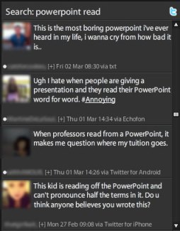
Tweets about boring PowerPointAccording to a recent survey conducted by PowerPoint designer Dave Paradi, the number-one PowerPoint annoyance is when presenters read their slides to the audience. In fact, “reading from the slides” has been one of the top five most annoying PowerPoint habits since he started conducting this survey in 2003! So why do people continue to do it? It’s simple.

Presenters read from their slides because they are unprepared.

Do Broadway stars read from scripts on opening night? Did Steve Jobs have a fistful of index cards at the ready during his legendary Apple keynotes? Of course not. Great presenters know what they’re talking about, know their lines, and rehearse, rehearse, rehearse!

If you are guilty of reading to your audience from your slides, stop it right now. Though they might not come right out and say it, inwardly they’re seething, counting down the seconds until the end of your presentation, and tweeting snarky comments about #DeathByPowerPoint.

Why you shouldn’t read from your slides

If consistent survey results over the past nine years and nasty anti-PowerPoint posts in Twitter don’t convince you, here are five more reasons you shouldn’t be reading from your deck:

  1. You look unprepared. The only reason to read from a PowerPoint slide is if you don’t already know what’s on it. If you don’t know your subject inside and out, then why are you presenting?
  2. You waste people’s time. If everything you want to communicate is on each and every slide, why are you asking people to give up the time it takes to attend your presentation and listen to you read? Wasting people’s time costs money—estimate the hourly salary of each attendee in your presentation, add it together, then multiply that amount by how long it takes to read your deck to them. Do the world a favor and if you’re gonna stuff all your text into your deck (which you shouldn’t do, by the way), just email it to people. They read the deck on their own time and get your message. Maybe.
  3. You waste your own time. You have a captive audience in the room with you, listening in silence to your every word. Don’t blow this golden opportunity to tell your story, to lead people to the conclusions you want them to reach, to add your perspective and insights, and—most importantly—to engage with your audience.
  4. Your slides look ugly. PowerPoint is a visual medium. When you cram loads of text onto a slide, it just looks bad.
  5. You look stupid. The bottom line is that if all you do is read your slides to the audience, you look like you don’t know what you’re talking about.

Your turn

Have you ever sat through a boring presentation where the presenter reads directly from his slides? If you have read from your own slides to an audience, why did you do it and what was their reaction?


Slide numbering in PowerPoint is stupid. Discuss.

December 7, 2011

boring slide numberingMore often than not, people ask me to include slide numbers on their decks. Maybe it makes them feel like they’re accomplishing something if they glance at the screen and see that they’re on slide 92, I don’t know. But putting slide numbers on your decks is a holdover from the last century and if you do it you should stop immediately! Why? Consider the following:

  • PowerPoint is not a print medium. How many times have you watched TV and seen a counter ticking down the minutes until the end of the program? Answer: never. Since PowerPoint is primarily a visual, on-screen medium, calling attention to the passage of time by including sequential slide numbering is pointless. To the audience, PowerPoint presentations are measured in the length of time it takes to deliver them, not the number of slides they contain.
  • Animations can inflate the size of the deck. It is often easier to break animations across a series of slides so that elements can be edited easily. To the audience it looks exactly the same as if everything’s on the same slide…except if the slides are numbered. In this case, slide numbers can be confusing (“How did we start on slide 3 and end up on slide 10? Did I miss something?”).
  • Slide numbering is distracting. How would you feel if you were at a presentation when suddenly you noticed that the speaker was on slide 110? Would you think “Boy, this presenter sure has a lot of knowledge to impart!” or “Holy cow, 110 slides? How much more of this do I have to endure?” By numbering slides, you bring your audience out of the moment and give them an opportunity to speculate on how many slides they’ve seen and how many are yet to come. Don’t distract your audience (Squirrel!); allow them to focus on the most important part of your presentation: you.
  • PowerPoint already keeps track of slide numbering. All slides in a PowerPoint deck are numbered in the Outline, Slide Sorter, and Notes views. So my clients can tell me “Please change the image on slide 5” and I know exactly where to go in the document.

So if slide numbering detracts from visual, kinetic storytelling, makes it look as though the audience might have missed something, is distracting, and doesn’t help during editing, why do it?

Your turn

You know where I stand on slide numbering, now I’d like to hear from you. Do you number your slides? Why or why not?


Should my logo be on each PowerPoint slide? No.

October 16, 2011

I'm Bob Jones of Bob Jones InvestmentsNow, I know you’re probably thinking along one of these lines:

“We paid a lot of money for that logo, and I want people to see it!”

“I’m reinforcing my company’s brand by showing my logo on each slide.”

“That’s the way our template was designed.”

I would counter that if you start and end strongly during your presentation, with a good title slide that has your logo on it and an ending slide with your logo and contact information, then people aren’t going to suddenly forget that they’re at the XYZ Company presentation during slides 2-48.

Branding has many aspects; logos are just a part of it. A company’s brand identity comes across in the designs they choose, the typography, the style of photographs and/or illustrations, the color palette, the type of messaging they employ (e.g., playful, serious, trustworthy, irreverent), their jingle, uniforms or clothing color, etc. etc. etc. These things come into play in all components of a company’s marketing mix, including the PowerPoint presentations.

Need more convincing? Well, let’s think of the logo-on-every-slide deck as a real-life conversation:

“Hello there, I’m Bob Jones of Bob Jones Investments. Thanks for visiting Bob Jones Investments today! I’m Bob Jones of Bob Jones Investments. How can I help you? I’m Bob Jones of Bob Jones Investments. I specialize in retirement planning. I’m Bob Jones of Bob Jones Investments.”

You see what I’m getting at here? People don’t need a constant reminder of where they are, who you are, why they came there, and what company you’re from.

You need more convincing? Well, how about this: your logo’s taking up a lot of real estate on the slide, room that could otherwise be used to get your message across.

Slides with and without logo in footer

Take a look at the slide on the left. Because the logo is part of the footer and must remain separate from other slide elements, it is taking up about a quarter of the slide! It’s competing visually for our attention with the graph because of the clashing colors and all that white space surrounding it.

In the slide on the right, the logo is gone so the graph can be bigger, placing the emphasis on the data.

So, not insulting the intelligence of your audience and having more room for important information on each slide. Pretty compelling reasons not to put your logo on every single slide, eh?

Your Turn

What do you think? Is it important for you to have your company’s logo on every slide in the deck? Why or why not?


How much text on a slide is too much?

October 6, 2011

Minimalist slide

It’s surprising how many presenters equate loads of text on a slide with effective information transfer. Some people believe that if they include every last scrap of data on the subject they’re presenting that their audience will become as knowledgeable as they are. News flash: it doesn’t work.

People do not attend presentations to read, they do so to learn. And you are the teacher.

In Don’t Make Me Think, required reading for anybody who deals in information design, Steve Krug writes about the attention span of a typical Web user. It’s minimal. People often visit Web sites with a specific purpose in mind: learning more about a product, getting somebody’s contact information, and comparing prices, for example. They don’t want to mine for information, it needs to be readily available and immediately apparent to the most casual observer. So Web designers must make it easy for people to accomplish these tasks. This book explains how it’s done.

The same principle is true for PowerPoint. You have to make your message really obvious to your audience. When you cram tons of text onto a slide you are making people work too hard because instead of listening to you they’re reading. The slow readers will be frustrated if you advance the slide too soon and the fast readers will be waiting for you to catch up. Either way, you’re shifting focus away from the main reason people have for being in the room: listening to you.

Here are two popular rules for PowerPoint design to get you started on the concept of Less is More.

  • The Takahashi Method: Invented by Japanese computer programmer Masayoshi Takahashi, this style is characterized by stark white slides with large black text like the slide at the top of this page. There is only room for a few words, so once the audience has read them all of the attention must focus on the presenter. Read Garr Reynold’s blog post, Living large: “Takahashi Method” uses king-sized text as a visual, for more information.
  • The 10/20/30 Rule: Marketing evangelist Guy Kawasaki came up with this formula for making PowerPoint presentations easier for an audience to view. 10: The optimal number of slides in a presentation / 20: The number of minutes your presentation should last / 30: The minimum point size of text on each slide. Read Guy Kawasaki’s blog post, The 10/20/30 Rule of PowerPoint for more details.

These rules are not hard-and-fast and there may be some instances where you need to have more than two words on a slide or ten slides in a presentation. But keep them in mind and always strive for simplicity. Your audience will thank you.

Your Turn

Do you use lots of text on your slides? If so, why? Has either the Takahashi Method or Guy Kawasaki’s 10/20/30 Rule changed the way you create slides?


“Oh, you didn’t know that?”

September 1, 2011

Closed sign on doorHow many times have you heard somebody say, “Oh, everybody knows that!” If you happen to belong to the lucky group that “knows that,” you may smile and nod sagely. But if you’re out of the loop it can make you feel foolish to hear these words. Something happened to me recently that clearly demonstrates that depending on one’s perspective, common knowledge isn’t always universal.

I brought my oldest son to an orthodontist appointment one Friday morning in July. We arrived early, but the office door was locked and all the lights were out. A sign on the door said that the office was closed for renovation and that the orthodontist would be seeing patients in one of two offices, each of which is about 20 minutes away from where we currently were.

I called the number on the sign to confirm that we had an appointment and the receptionist assured me that it was still on. “But I’m at your office and it says you’re closed.” “Oh, we’re never at that office on Fridays! The doctor always works out of this office on Fridays.” We were able to arrive at the other office only 15 minutes later than the original appointment time, so luckily we didn’t need to reschedule. But the experience was an excellent lesson about making assumptions.

The receptionist lives with the fact that she works out of a particular office on Fridays and a different office on other days — she has to change where she shows up to work from day to day. My son is a new patient and this was our second visit, the first having been several months earlier. I had no idea that there were any locations other than where we’d been before, and we’d had no contact from the office in that time.

Something similar happened to me earlier this year, when a salesperson from the auto dealership my family and I have been doing business with for six years casually mentioned the fact that they would be moving to a different town. Old hat to them, news to me! (Read about this exchange.)

How does all of this relate to PowerPoint? Well it shows that you can’t make assumptions about what your audience knows about the subject you’re presenting. An annual shareholder meeting is a perfect example; this audience convenes once a year, so the presenters must communicate all the developments that have occurred in that time. Even if your company has been working day and night to get Product X out the door, your clients probably don’t know about it, so you shouldn’t talk about it like it’s old news. It makes people feel neglected, not a good feeling to instill in one’s clients!

If you don’t know what your audience doesn’t know…ask. That’s how you can determine whether you need to explain things step by step or launch right into your subject. Don’t waste people’s time either by presenting confusing information or boring them with needless explanations. It’s like they say, never assume or you’ll make an ASS out of U and ME.

Photo credit: keyseeker from morguefile.com


The Principals of Copyright

August 31, 2011

You may have noticed a potential misuse of the word “principal” in the headline of this blog. But it was no accident: the subject of this blog is the new principal of my sons’ school. She gave a PowerPoint presentation that violated one of the main principles of the use of copyrighted images: you must pay for what you use.

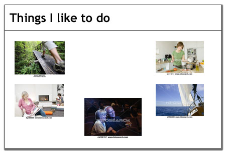
The new principal was hosting a meet-and-greet to introduce herself and was telling us about her background. One of her slides detailed her hobbies, and looked something like this:

Bad PowerPoint slide

Apart from the fact that these images are tiny and therefore don’t communicate as well as they would if they were larger, they are clearly cut and pasted from a Web site, as indicated by the watermarks and the file information that appears below each one. I don’t think it made an impression on anybody else in the audience, but it made a profound one on me.

Photographers make money from the sale or licensing of their images. That’s why photo processing centers will not make duplicates of any photographs that bear the photographer’s or studio’s copyright mark, and it’s also why a portrait session with a professional photographer generally doesn’t cost a lot (they make their money by selling prints).

The Web has been both a blessing and a curse for photographers. On the one hand, it’s easy to get one’s work seen by a vast audience of potential clients. On the other hand, it’s incredibly easy to copy images from a Web site and paste it into whatever one wants. For free. And that amounts to stealing.

Photographers and royalty-free photo sellers such as iStockphoto, Getty Images, and Veer imprint all images with a watermark, usually a logo going right across the center of the image. It is supposed to prevent people from using images they haven’t purchased or licensed, but in this case it wasn’t enough of a deterrent.

While this instance of copyright infringement didn’t register with this group, imagine if someone did this in a corporate setting, say at a keynote presentation, annual sales meeting, or client pitch. The presenter would be demonstrating that:

  1. He didn’t pay for the artwork
  2. He doesn’t care if everybody knows it

Realistically, there is very little that photographers and their agents can do to prevent this type of copyright infringement. There are no Copyright Police who surreptitiously attend corporate meetings. You are not going to jail for snagging a picture from flickr and not correctly attributing it. And people typically are not going to report you for engaging in this practice. Legally, though, it is stealing. Ethically, stealing is wrong. By not paying for images we use in our presentations, we are saying that stealing is OK sometimes if nobody catches us doing it. Is that true?

You can be sure that I will be speaking with our new principal about copyright issues and the unconscious messages she’s sending so that she doesn’t make the same mistake again.


Get Your Facts Straight

June 20, 2011

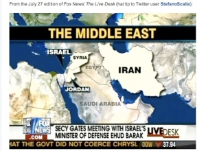
Bad Middle East mapI’ll admit it, I was glued to the television for the premiere of Falling Skies, the latest series to tackle life in a post-apocalyptic world. I loved just about everything about it: the premise, the plot, the special effects. But one thing really bothered me, and that was the geographical inaccuracies. It made me think that a few wrong facts can really derail your message.

The story is set in Massachusetts six months after an alien invasion. The aliens have just bombed Boston, so the surviving humans must leave the city and fan out to the suburbs. While I congratulate the writers for using the actual names of Massachusetts towns, the dialogue contained many made-up facts.

The survivors are split up into several smaller groups, one of which is instructed to travel north on Route 3 until they reach Revere. Uh, Route 3 doesn’t go anywhere near Revere. Another group must go to Acton, meeting at the (nonexistent) Littleton Bridge before they reach their destination. Excuse me, Littleton is further west, so they’d actually travel through Acton to reach it. When they finally make camp in Acton, they dispatch some scouts to the (fictitious) Acton Armory and climb a hill with a commanding view of Boston (which, if you could actually see from Acton, would look much farther away than it does in the show).

It’s true that for the vast majority of viewers, these things didn’t matter at all. Everybody knows that Hollywood takes liberties and that it’s impossible to get all of the details exactly right. But the inconsistencies pulled me out of the story. And they would have been so easy to avoid if the screenwriters had just consulted a map.

What has all this got to do with presentations? Well, if your presentations include “facts” that you haven’t checked, or if you make claims or include information that is later proved to be inaccurate or false, you will lose credibility. People will ignore your message, preferring instead to wait for your next mistake. They might even let you get to the end of your presentation before telling you that you are wrong. Worse, they’ll say nothing to you but Tweet, blog, and email all their friends and colleagues about what a dope you are. Is that your message?

Make sure you have all your facts straight for every presentation. That one time you stretch the truth or include information you haven’t verified, there’s bound to be someone in the audience who’ll know you’re wrong.